The Muny - Rebrand
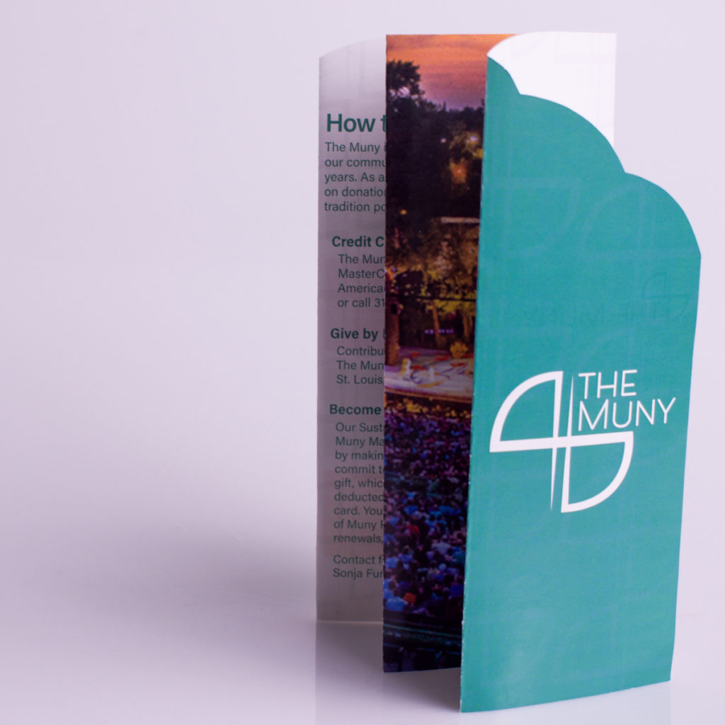
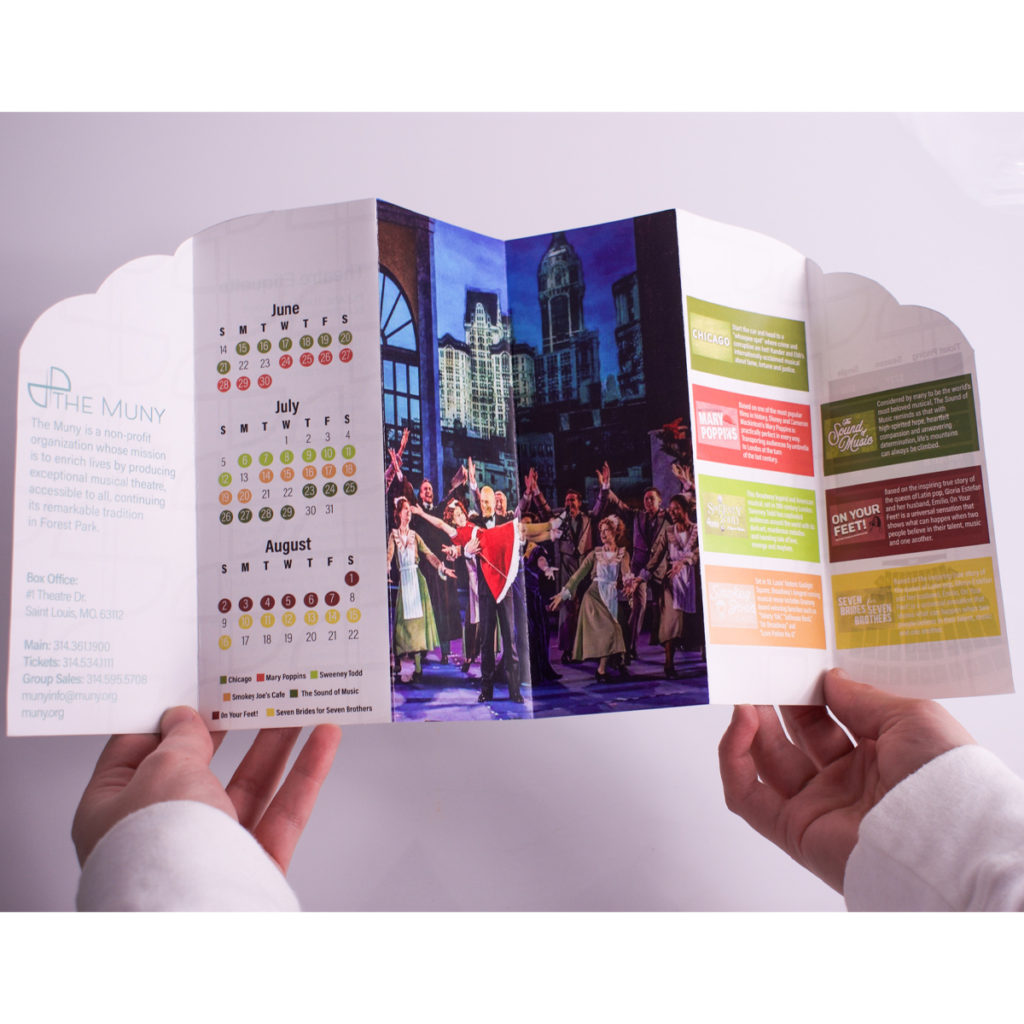
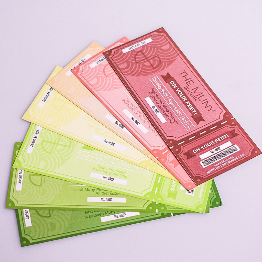
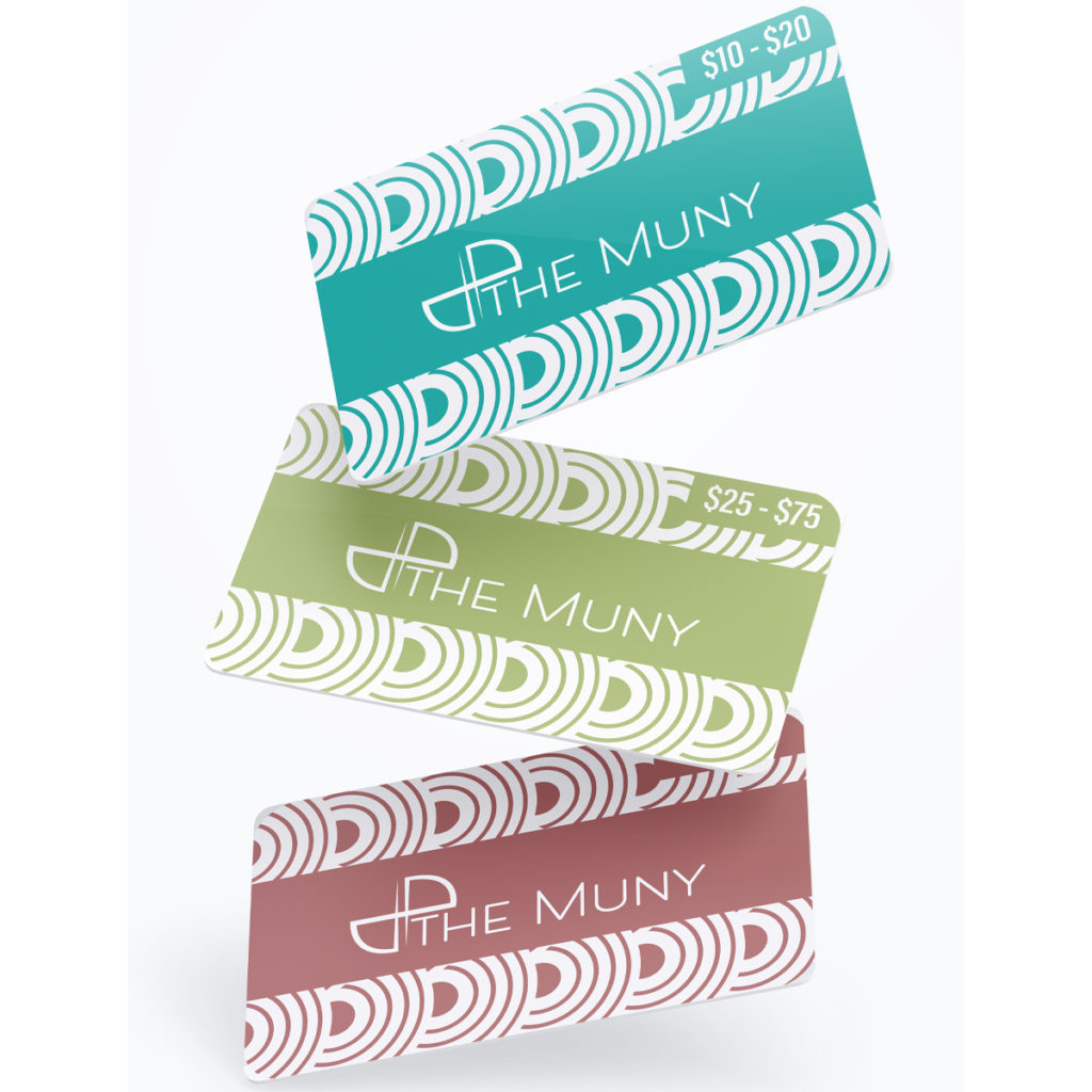
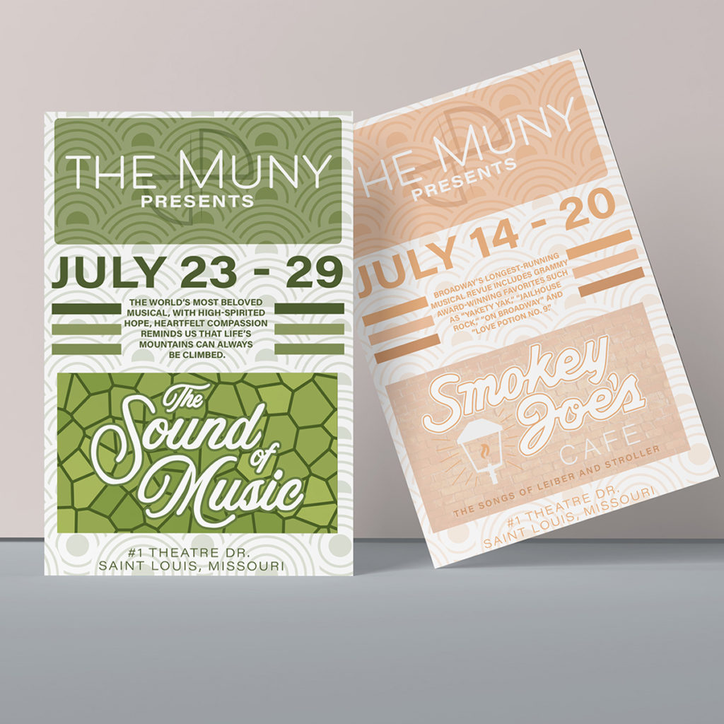
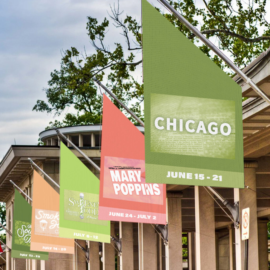
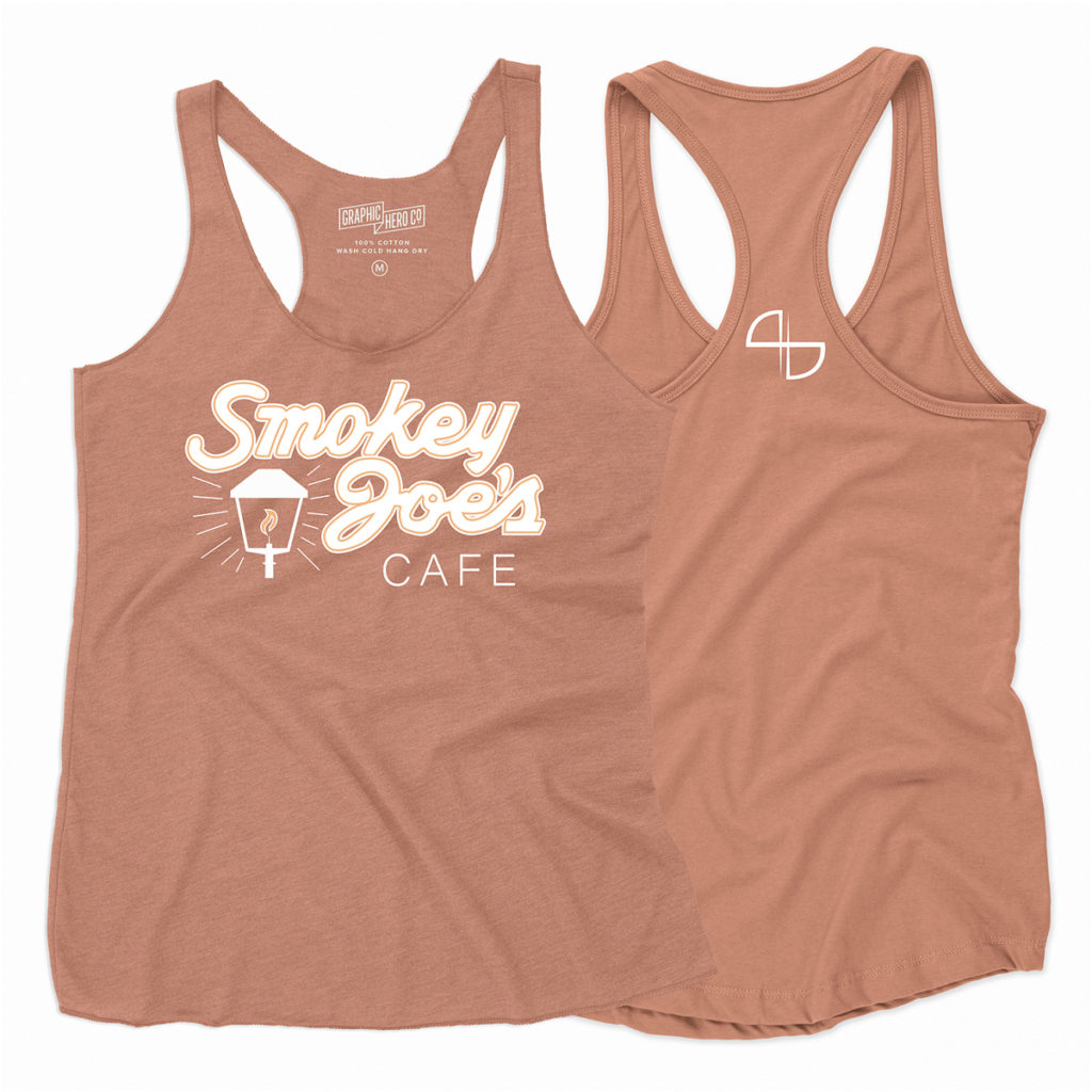
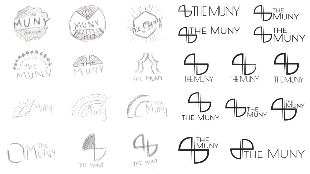
The main idea of this project was to re-brand a venue or an event. I chose the Muny because it is one of my favorite venues, but I felt as though it lacked a consistent identity. I based the logo off of flags that were used in old theatre to direct the actors and actresses. I chose my color palette
because I felt that those colors best matched
the Spring and Summer season which is
when the Muny is open. This struggle of
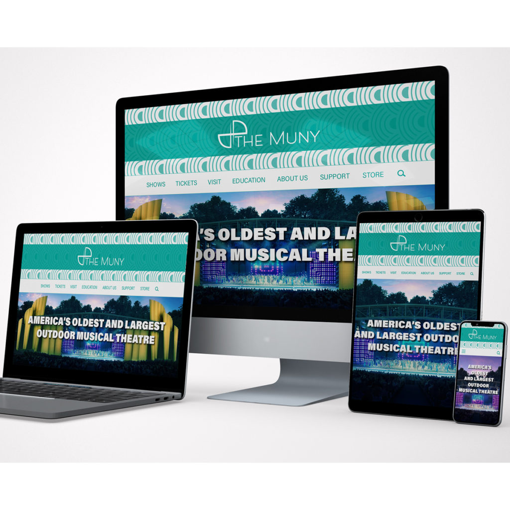
this project was making each object
feel consistent within the brand.
